01 / Freelance · Consumer Mobile
WeGo Golf
A long, drop-off-prone signup, rebuilt across two rounds of client work that led to a 19% increase in signups and a 0→1 scoring mechanism.
Role
Sole Designer (freelance)
Company
WeGo Golf
Platform
Consumer mobile · Event onboarding
Outcome
+19% signups · 0→1 scoring
Skills applied
Overview
WeGo Golf brings mobile virtual golf to public and private events like football games, festivals, and corporate parties, across 30-plus states. The founder, Dr. Anthony Franklin, brought me on to solve a specific problem. Onboarding was too long. It was turning people away, and the people who pushed through were entering junk data.
Dr. Franklin wore every hat on the other side, owner, product manager, and developer, so I was the only designer in the room. The first engagement ran two months. Months later he brought me back for a second round to push the signup further. This study follows this project across both the original project and the update.
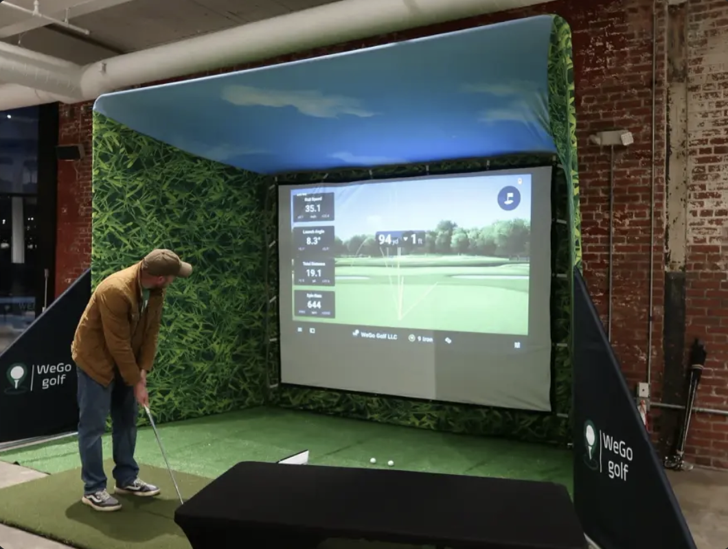
Research: who was actually in line
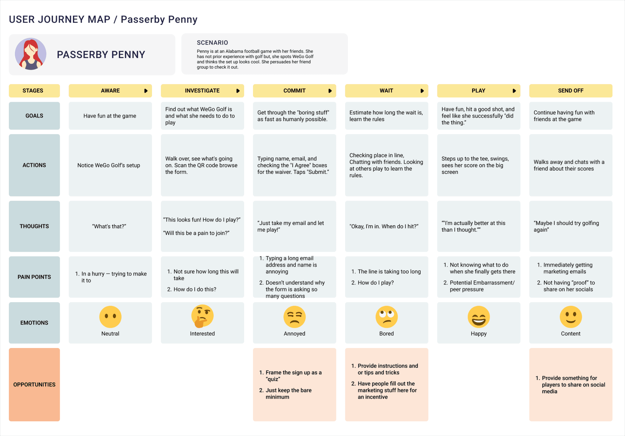
Because I got to start from scratch, a rarity in my enterprise work, I began with people. I built five user personas from the information Dr. Franklin gave me and my own research around these types of events. I met with his board and we validated the personas. During this meeting it became clear that one of the personas made up 90% of their users: Passerby Penny the casual non-golfer. This persona was the exact user who this flow had to win over and whose needs drove most of our design decisions.


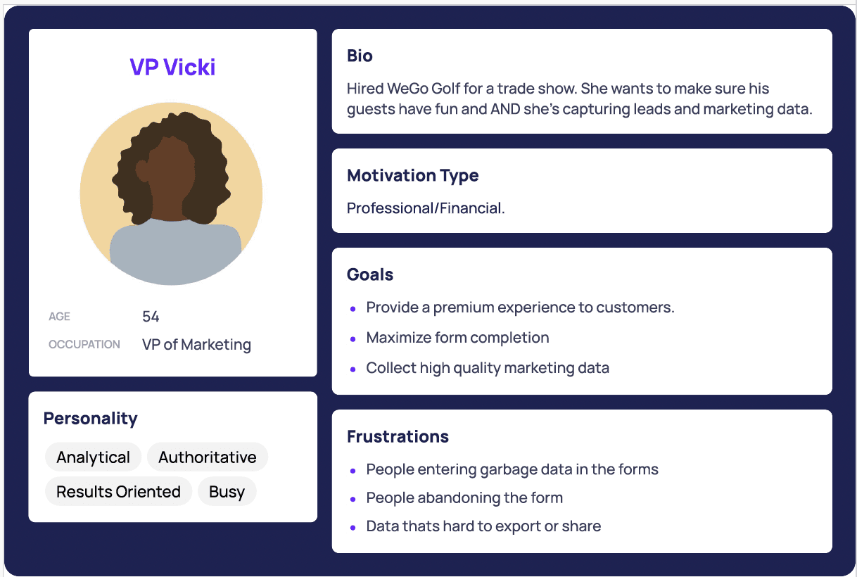
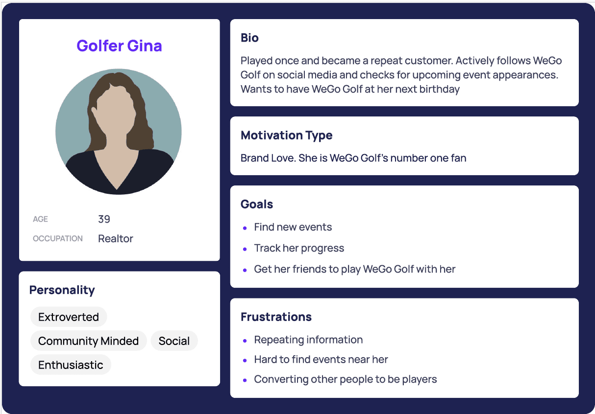

From there I built journey maps for all the personas but primarily focusing on Penny. Two insights jumped out at me. The biggest wasted space in the whole experience was time spent standing in line and there was almost no room for social sharing or friendly competition, at events where people often already know each other.
Lowering the front door
After I understood the customer, the problem and the opportunity I started untangling the onboarding questions. I was able to divide this into three main categories:
Legal / Functional
name, phone number and the liability waiver.
Company Data
WeGo allows the company that hired WeGo to ask their own data collections. For instance a college might ask "Are you interested in buying season tickets for our football team?" Allowing the company to ask these questions is what made bringing in WeGo worthwhile for events. The company hosting the events is paying for WeGo but in turn they get data.
WeGo Data
WeGo also collected its own data. Part of WeGo's monetization model was collecting data to better match other golf companies like clothing or equipment with potential customers. A company could elect to turn this off, but if they kept it on it was valuable information for WeGo.
I decided the best move was to stop asking for everything at the door and I sorted out what absolutely had to stay up front versus what we could move to another place in the customer journey. Legal stays upfront, always. Company data is the client's call, since some clients need it first. WeGo's golf data, the one lever I fully controlled, could move to after the main onboarding flow and the customer could fill it out while in line rather than as prerequisite for even getting in the line.
Visual and mobile craft
That split model is what shipped, and it moved the numbers. The front door shrank to the essentials, and the optional data moved out of the way.
“19% increase in submissions per event · 947 completed onboarding”
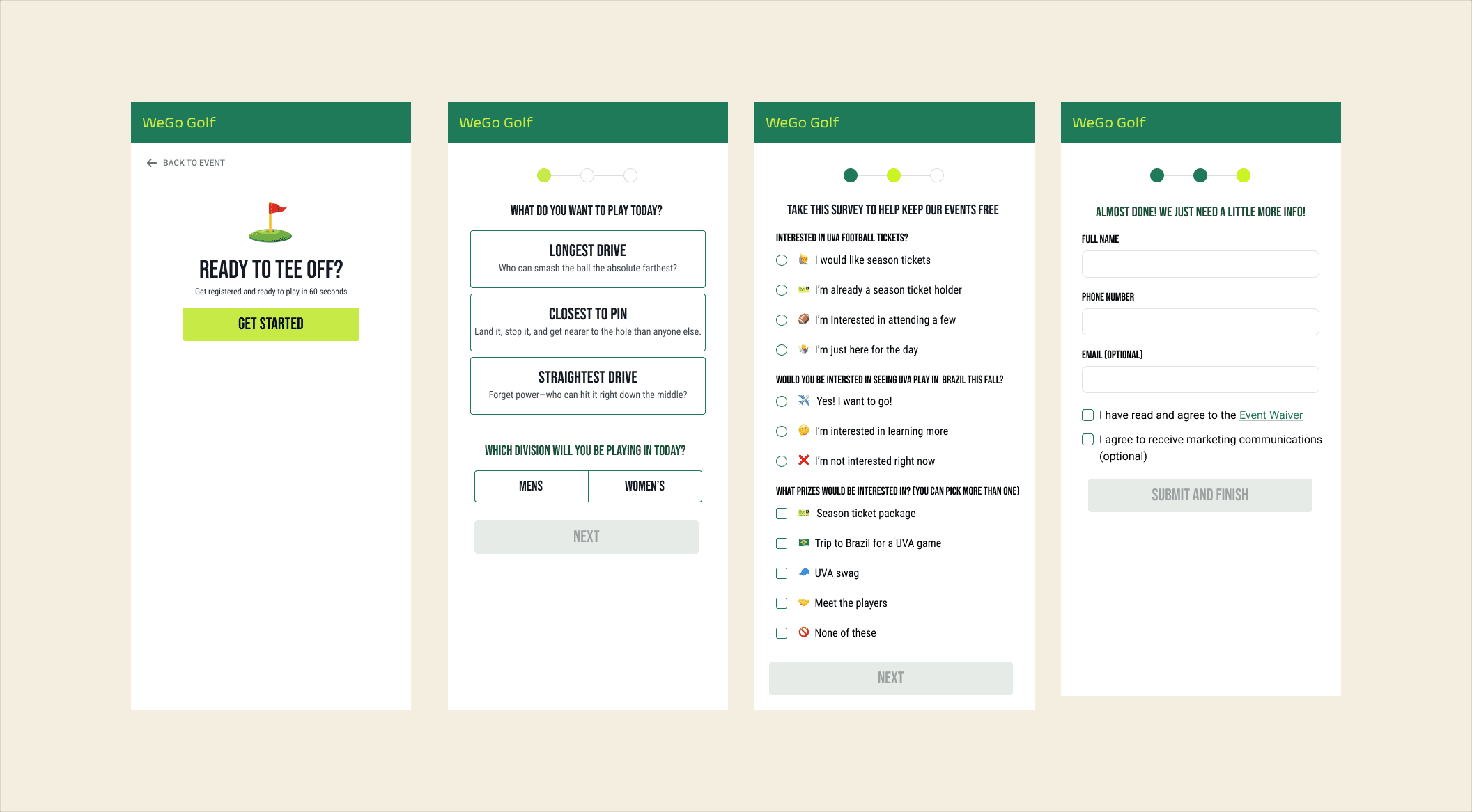
I also designed a quiz concept for the WeGo golf data. Rather than asking "what is your handicap" cold, the questions became a Buzzfeed-style quiz that revealed your golfer persona, with a shareable result to create the organic social sharing the journey map said was missing. The quiz was toggled off at launch and was never fully implemented in production. The idea mattered, though, and it came back in round two in a leaner form.

Scoring: the leaderboard and queue
The second insight was the missing competition. Before, once you played, that was it. No score, no scoreboard, and people closed the app to stand in a physical line.
Dr. Franklin was resistant at first, but I believed a leaderboard would do two things. It would give people a reason to play, and recording your score would give people a reason to seek out more WeGo events to beat it. He came around, and as luck would have it he had the perfect event to pilot it: the Clappers Cup.
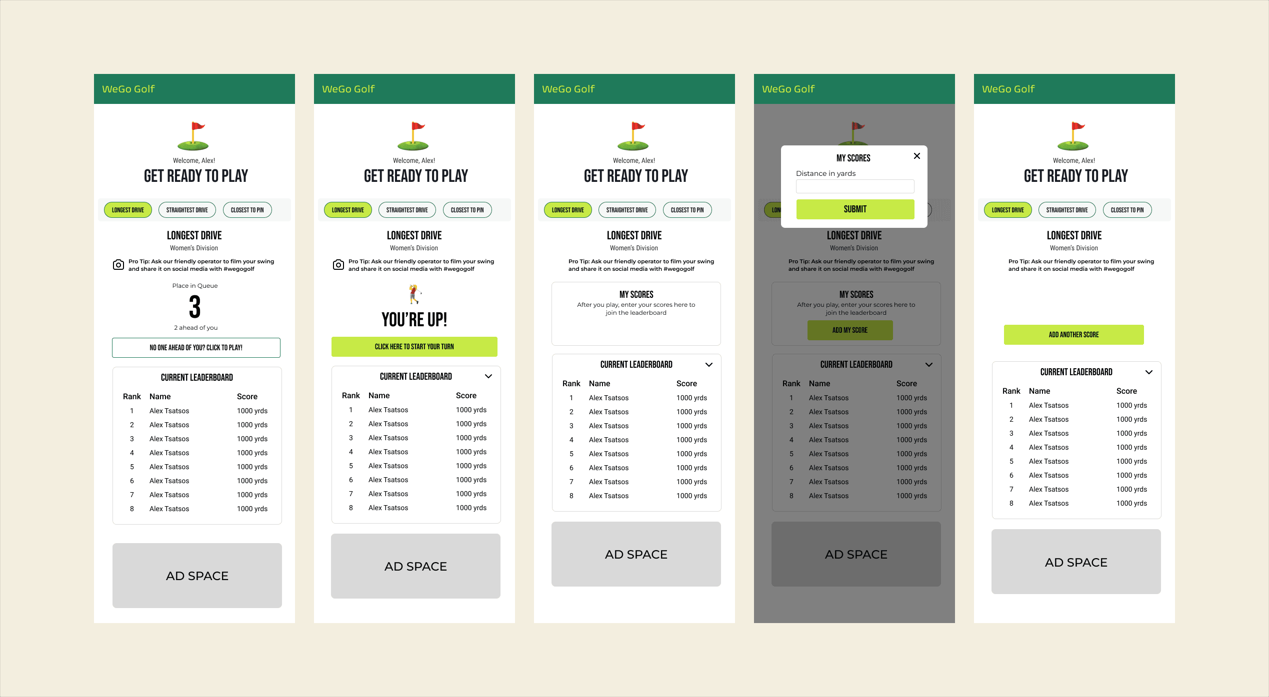
We added an onboarding step for people to choose which competition to enter, plus a flow for entering scores. But the most interesting design work lived in the queue.
I designed a live, in-app queue that updates dynamically, with score entry unlocking at the front. That worked for a perfect scenario, where people wait patiently, never leave, and enter scores only after they play. But I design for real people, not ideal ones, so I started mapping how it could break. Two problems stood out. What if someone leaves the line without closing the app, so the physical line and the virtual queue fall out of sync and the app never unlocks their score? And if we let people enter a score anytime, would they abuse it and enter fake ones?
“I design for real people, not ideal scenarios. So before anything shipped, I mapped how the queue could break in the field.”
I explored ways to prove someone was actually at the front: a QR scan, an operator-only trigger, blocks of warning text. Then I realized I was over-engineering for a problem I wasn't sure existed. Would people fake scores? I didn't know. Would people quit a confusing, heavy flow? Definitely. So I chose the simpler path. A primary button that enables when you reach the front of the queue, and a secondary fail-safe button in case the queue desyncs. We used the first event to watch whether fake scores were actually a problem.
Scores were optional on purpose, so a bad round never forces anyone to share. At launch, 27% of players recorded a score.
Designing for scale
Round two: going upstream
In early October, Dr. Franklin came back. People were still struggling with onboarding, but this time the problem was further upstream, before the form even started.
The way into the app is a QR code. You scan it, then pick which event you are at. On a busy day there could be a lot of events at once, and the full list was overwhelming. The clean fix would be a unique QR for each event, so a scan drops you straight into the right one. But WeGo's QR code is already printed on all of its marketing and merch, so changing it was not an option.
Designing inside the constraint
So I used the user's location to surface only the events near them, instead of every event that day. For anyone who did not want to share location, a dropdown to pick your state narrows it down instead. As an aside, Dr. Franklin first wanted this to be a map you tap your state on. I pushed back. I was fairly sure a lot of people cannot reliably find their state on a map, and that a dropdown is faster and more reliable.
From there I cut what was not pulling its weight. Tapping an event used to open a detail page, but it did not give the user any new information, so I removed it. Now tapping an event takes you straight to login. The signup was already an improvement over where it started, but at three to four pages Dr. Franklin had noticed it still felt cumbersome. I collapsed it to two with a longer scroll. To keep the denser pages from feeling like a wall, new questions appear only as you finish the ones before them.
This is also where the quiz came back, slimmed down. I mapped the essential marketing questions into no more than three quiz-like questions, light enough to live inside the signup instead of beside it.
I mocked all of this in Figma and handed it off. This round is still in flight, so I do not have results yet.
Reflection
This project started as one problem and turned into an ongoing relationship.
The onboarding redesign debuted at the Clappers Cup, and in the three months since, it has driven a 19% increase in signups with over 900 people completing it. Dr. Franklin was happy enough with the work that he brought me back for a second round to push it further.
What I'm most proud of is two things. First, that this was end-to-end experience design, not just interface design. Looking at the entire journey, from standing in line to sharing a score, is what surfaced the real opportunities. The dead time in line became the quiz and the competition. The overwhelming front door became a short, sorted one. Not all of it was certain, some was informed instinct, but it came from thinking end to end rather than fixing one screen at a time. Second, this is the project where I got to stretch my visual and mobile craft. It is the most consumer-facing, mobile-first work in my portfolio, and I leaned into making it feel energetic and on-brand, not just usable.
If I could revisit this: because this was a contract project, I had less room for follow-through than I would have liked. I would have loved to test the pieces individually to see which ones actually drove the lift. I would also revisit the pills I used to switch between competitions. They read a little like filters to me, so I would try tabs. The feedback was good, so they hold for now.