03 / nCino · Fintech Enterprise SaaS
Logic Builder
Turned a code-only tool into point-and-click, so customers build their own dashboard queries instead of opening a ticket for every one.
Role
Sole Designer
Company
nCino
Platform
Enterprise SaaS
Outcome
Code → no code
Skills applied
Background
At nCino, the product was data-heavy, and for the admins and implementation consultants who used it daily, defining search parameters meant writing code every time. That was a real barrier. I was asked to design a point-and-click logic builder that could let non-technical users define those same searches without ever touching a line of code.
I'd actually built an if/then statement builder for another feature earlier in my time at nCino, which had landed really well with users. My first instinct was to adapt that pattern here. Spoiler alert: it wasn't quite that simple.
This logic builder was one part of a larger backend flow I designed for the product's admin area. I was the sole designer on the project.
Initial Design
I came into my first feedback session feeling pretty confident. I had a solid if/then builder ready to go, and I figured this was a natural extension of something that already worked.
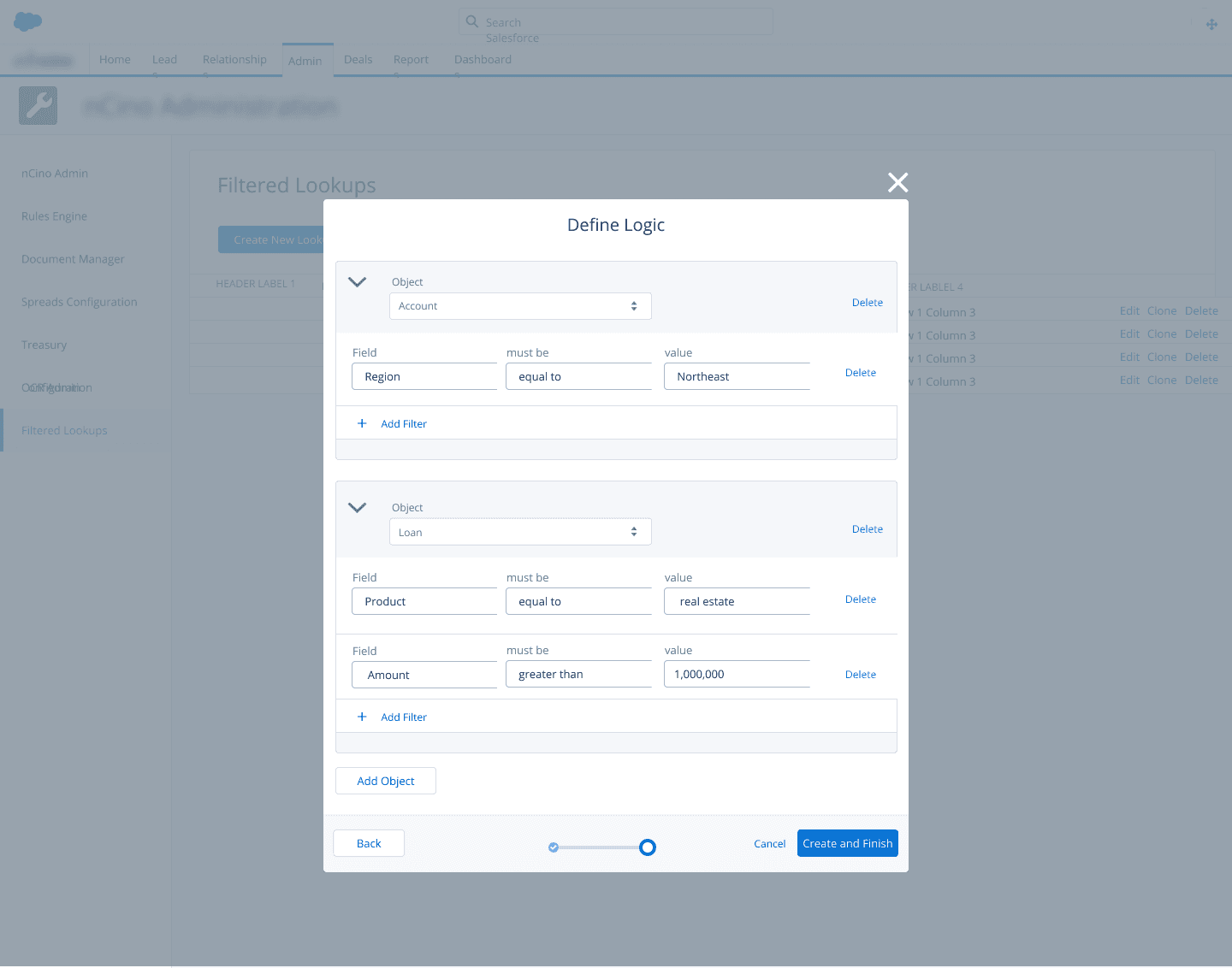
However, my friends in dev and implementation quickly found a flaw. The system I'd built handled individual statements fine, but it couldn't express the relationships between those statements. What they needed was the ability to combine conditions using and/or logic — and that's a totally different problem.
Back to the drawing board.
what I got wrong first
Research
I partnered with developers on the team to get a real grounding in logic and coding syntax before I started designing again. The key concept I needed to fully understand was the difference between an inclusive or and an exclusive or:
Inclusive or
A or B, or both.
Exclusive or
Either A or B, but not both.
Once I actually understood that distinction — not just the definition, but what it meant visually for a user trying to build a query — I knew the design was going to hinge entirely on making those two operators immediately distinguishable at a glance.
Design Solution
I explored a lot of directions trying to solve that visual distinction problem. I tried nesting — grouping related statements inside containers — but it got complicated fast and started to feel more like code than a point-and-click tool. I tried indentation, which had a similar problem: it worked for simple cases but broke down as the logic got more complex. I tried icons to signal the operator type, but they added cognitive load without really clarifying the relationships.
The breakthrough came when I stepped back and thought about the logic itself rather than trying to decorate it. I realized two things: 1) "and" statements are inherently inclusive, and 2) inclusive statements will always be adjacent to each other in the sequence. That meant I didn't need to label the relationship — I could show it spatially.
I started highlighting all adjacent inclusive statements in the same color. Suddenly, users could scan the builder and immediately see which conditions were grouped together and which were exclusive — no labels, no nesting, no extra visual noise.
the breakthrough
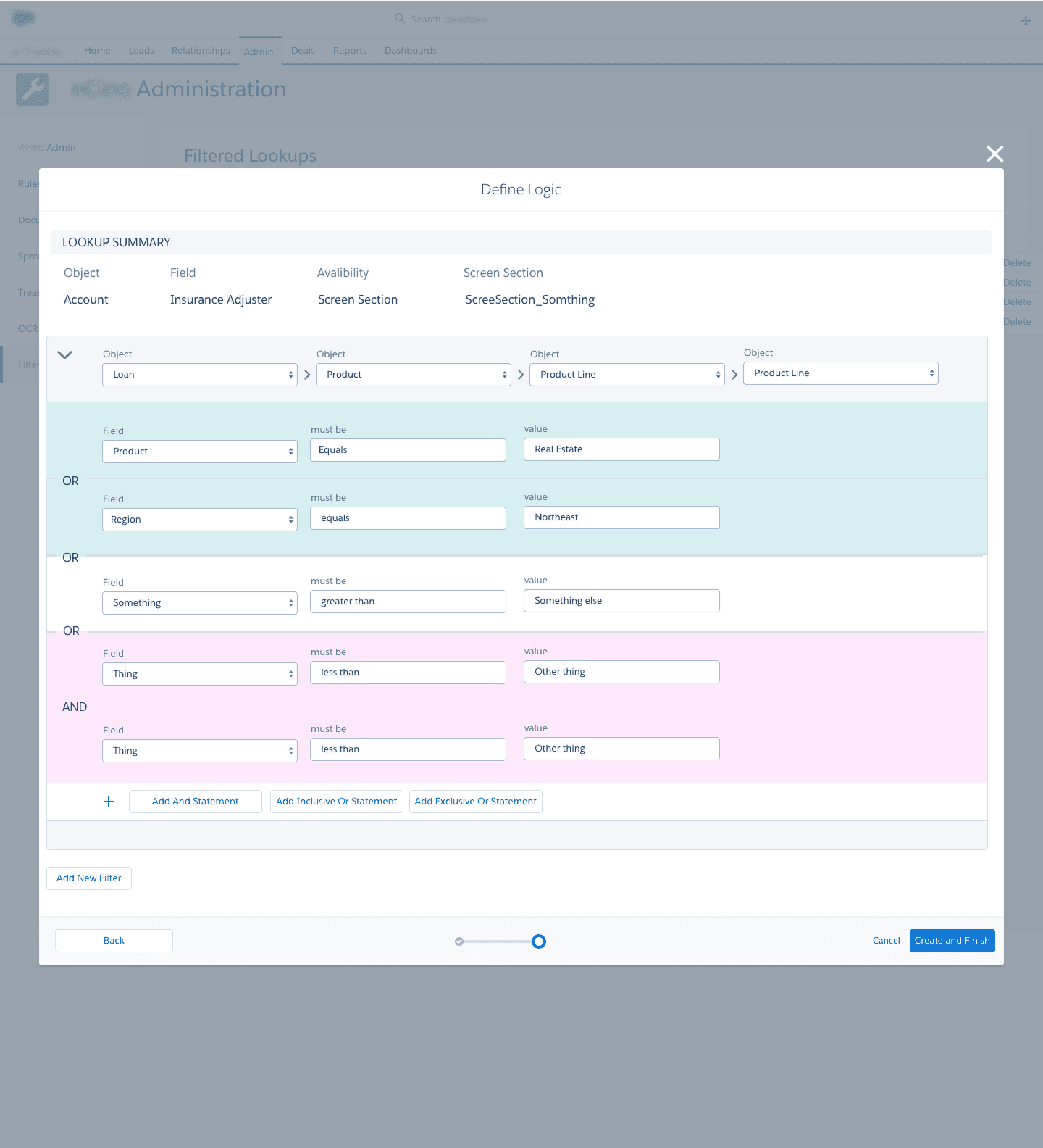
the accessibility consideration
The response from users and stakeholders was genuinely enthusiastic. They said it felt intuitive and, importantly, that it would be easy to teach to non-technical users — which was exactly the goal.
Interactive Prototype
See the color-coded logic builder in action — best viewed in full screen.
Reflection
One of my favorites — because it pushed me outside my wheelhouse.
Working closely with developers to actually understand logic syntax made a real difference in the outcome. This is the kind of project that wouldn't have worked if I'd stayed on the design side of the fence.
If I'd had more time and the chance to take it further, I would have loved to run usability tests with a wider group of non-technical users. The stakeholder feedback was positive, but real-world usage always surfaces things that controlled feedback sessions don't.
The solution wasn't shipped before I left nCino, so I never got to see how it performed in the wild.